UT Grades+
Figma
Duration
2 weeks
Role
UX/UI Designer
Type
Web Design
Tools
Overview
Project Content
Students utilize our platform to access comprehensive resources for course planning. They can explore past courses' grade distribution data, providing valuable insights into course difficulty and performance trends. Additionally, students have direct access to UT's official course feedback page, allowing them to read reviews and evaluations from previous students to inform their decision-making process. Furthermore, students can access past syllabi, providing detailed course outlines and expectations to help them plan their schedules effectively and prepare for upcoming courses. By offering these valuable resources, our platform empowers students to make informed decisions and succeed academically.
Problem Statement
How can we help students effectively find the courses they want to register for?
Currently, there is no centralized platform where students can access comprehensive course grade distribution data. This means that students often find themselves navigating through a disjointed array of sources, including unofficial websites, forums, and word-of-mouth, in order to gather the information they need to make informed decisions about which classes to take. Without an official platform to provide standardized and easily accessible grade distribution data, students may encounter inconsistencies in the information they find, leading to uncertainty and inefficiency in the course selection process.
Goals

Present accessible data representation
Simple and minimal website navigation

Include the latest grade distribution data
Research
Competitive Analysis
We performed a competitive analysis among 2 other websites, UTD Grades (https://utdgrades.com/#) and a student-built platform (https://derec4.github.io/ut-grade-distribution-viewer/). These platforms provided valuable insights into effective presentation styles and user interface designs for showcasing grade distribution data. Studying their approaches deepened our understanding of user expectations and preferences, as well as identified potential features for enhancement. This insight informed our design decisions, ultimately enhancing the overall user experience of our platform.
Insights from Competitive Analysis
Graphic data distribution
Easily understandable graphs
Ability to multi-select
Simple filtering/searching system
Ideation
Sketch
Before jumping into making our wireframes, I started by creating some design ideas and features we wanted to incorporate into the platform using the insights and feedback we got from our research.
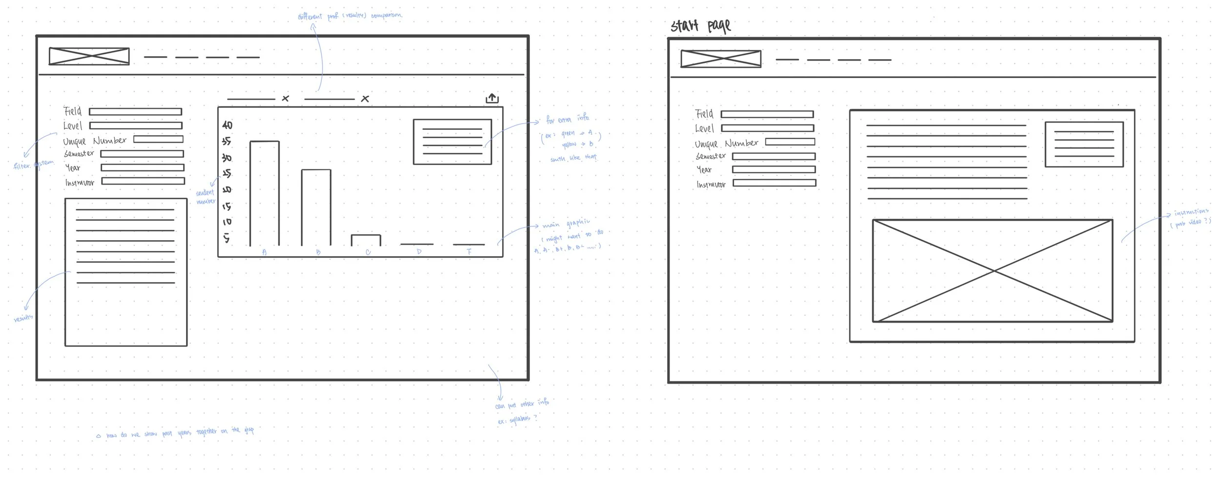
Low-Fi Wireframes
Design System
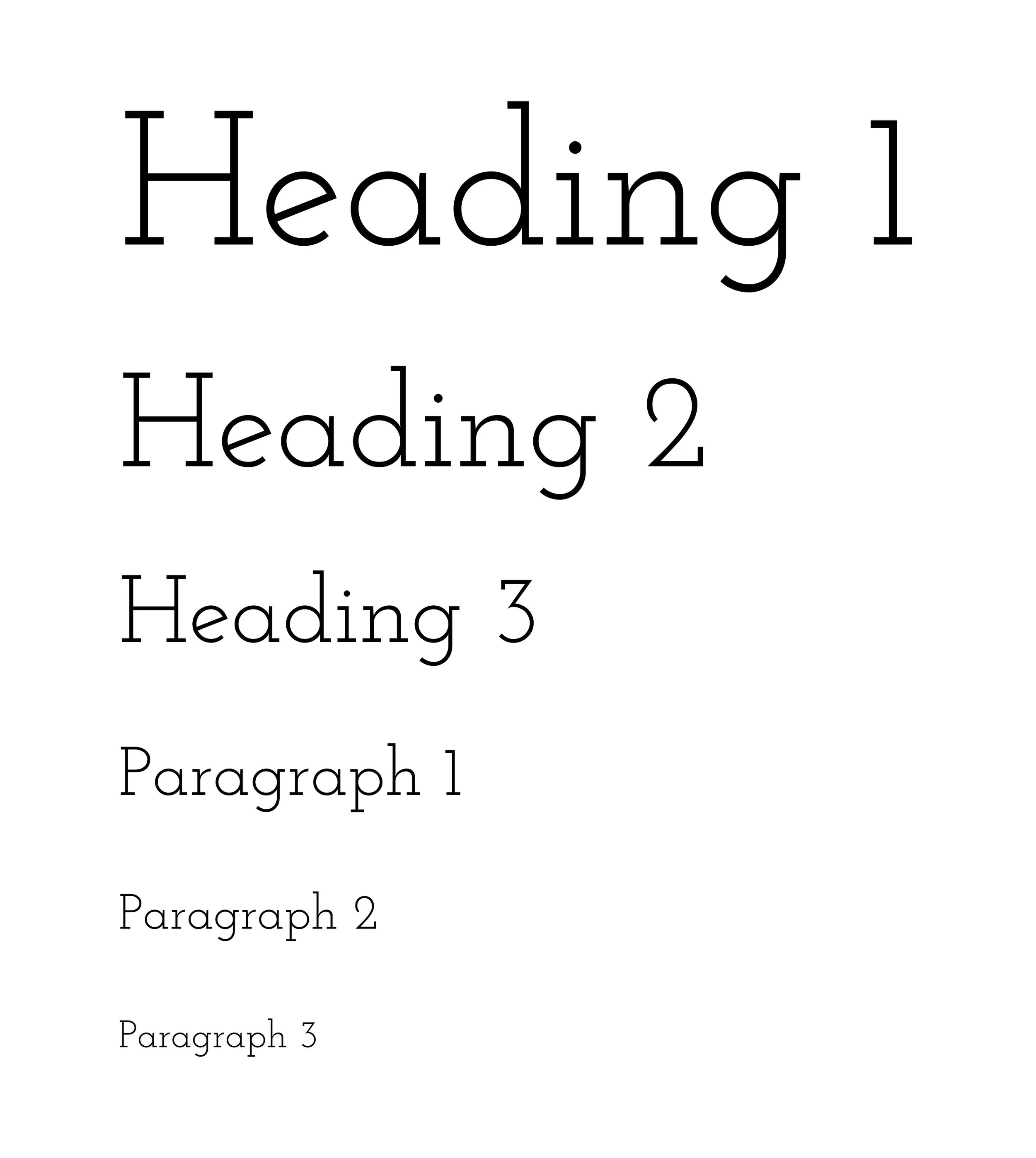
We decided to use Josefin Slab fonts for their elegant and modern appearance, which aligns well with our vision for the platform. The clean and minimalistic design approach we're aiming for not only enhances the overall aesthetic appeal but also promotes readability and ease of navigation for users. By keeping the design simple and uncluttered, we can create a visually pleasing experience that focuses on the essential content and functionality of the platform, ultimately improving user satisfaction and engagement.
Final Prototype
Key Features
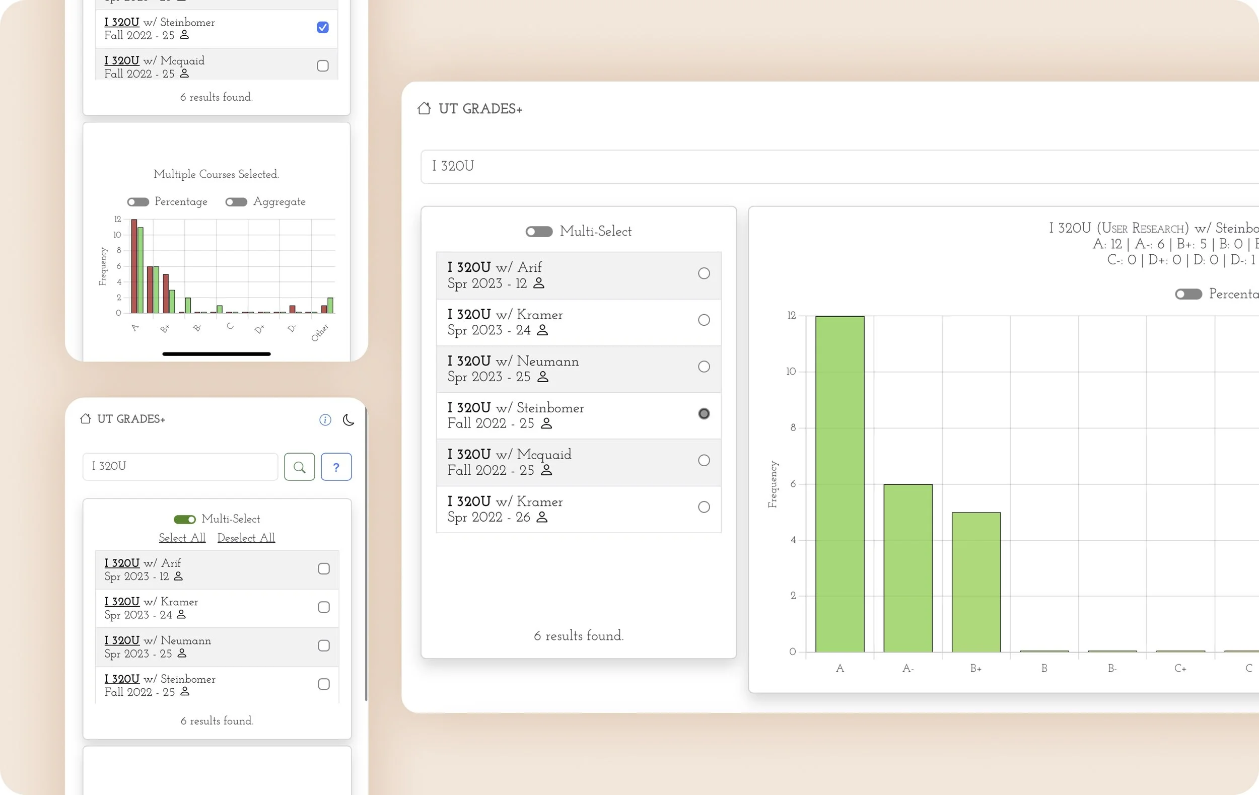
Multi-selection: To cater to the needs of students who often seek to compare courses, we implemented a multi-selection function. This feature enables students to conveniently assess and contrast the grade distributions of various courses directly on our platform. By allowing side-by-side comparison, students can easily identify trends and patterns across different courses, aiding them in making informed decisions during course selection. This functionality not only simplifies the process of evaluating courses but also reduces the need to open multiple web pages simultaneously, streamlining the user experience and enhancing efficiency
Smart search bar: Having a smart search bar offers numerous benefits. It allows users to quickly find relevant information without browsing through multiple pages, saving time. Users can easily discover courses, feedback, or syllabi by entering keywords, enhancing usability. Advanced features like filtering options provide tailored search results, improving the experience. The intuitive functionality encourages user interaction, leading to increased engagement. Ultimately, the smart search bar reduces frustration and enhances satisfaction by efficiently delivering the needed information
Graphic-view distributions: Graphic-view distributions enable visual comparison of grade distributions across courses, aiding in quickly identifying trends. It also enhances understanding of complex data, facilitating decision-making. Interactive graphics allow dynamic exploration, increasing engagement. Overall, graphic-view distributions streamline comparison, reducing cognitive load and saving time for students, enhancing platform usability
Reflections
Next Steps
The project was done during winter, which made it harder for us to find students who were willing to do face-to-face user interviews, both in-person and online. Could use UserTesting.com to reach out to a larger user base and find undergraduate students who can do user interviews or testing
Redesign some features of the platform for better accessibility
We included a feedback form for students to provide comments and suggestions for improvement. We review the form monthly to ensure that necessary enhancements are implemented